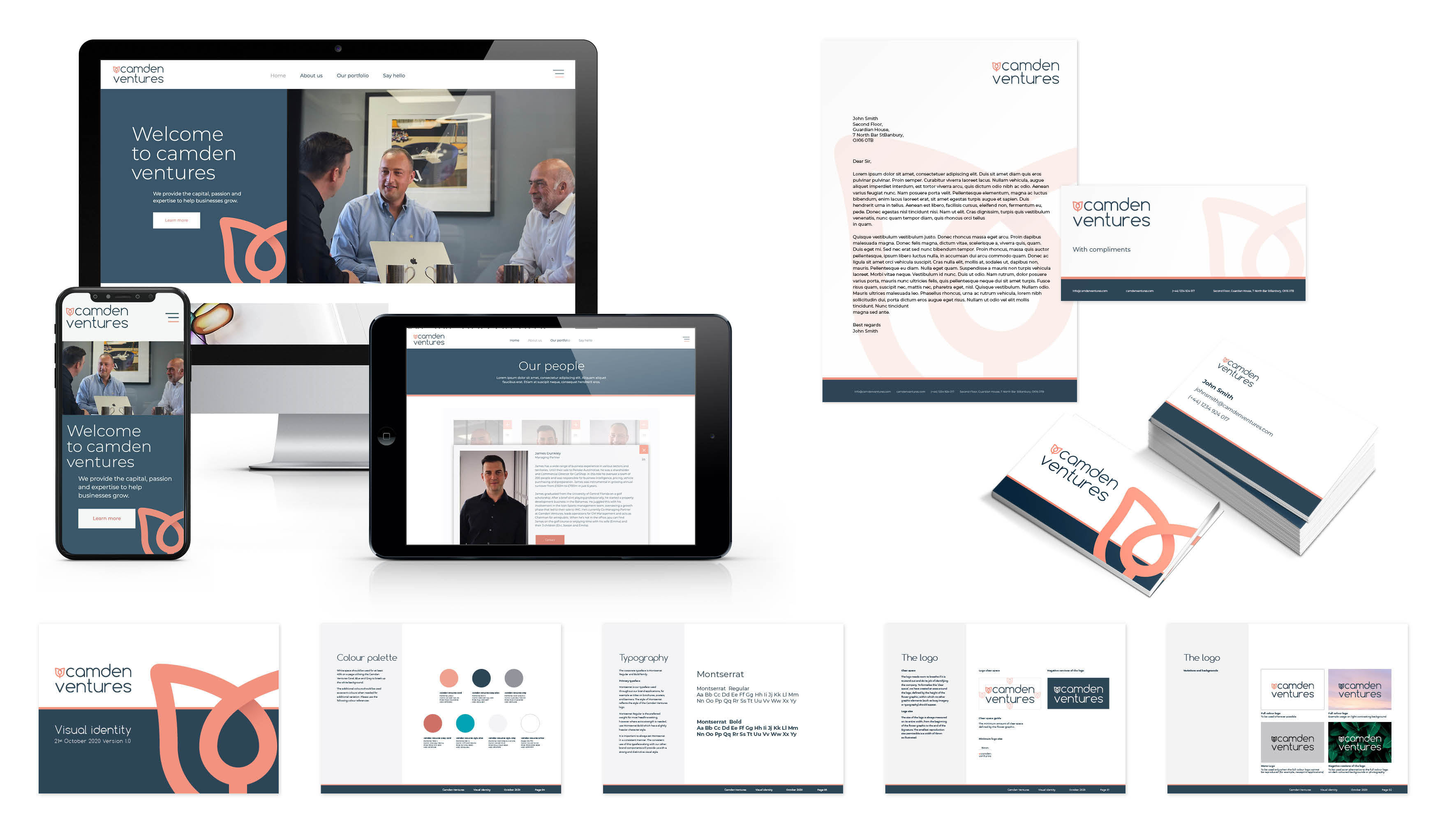
An initial workshop was set up so our team could delve deeper into what makes Camden Ventures tick. While they live and breathe great business, they are also approachable in character and provide a consultative personal approach. Camden Ventures also know how to leverage technology, and invest not just funds but their hearts and minds into each client. It was crucial that the branding should reflect this.

We then started devising ideas for the right look and feel for the branding, tone of voice and website. Camden Ventures target start-ups and entrepreneurs, and are in their element when investing in consumer-facing growth markets - it was therefore key to make it simple, fresh and inspiring.

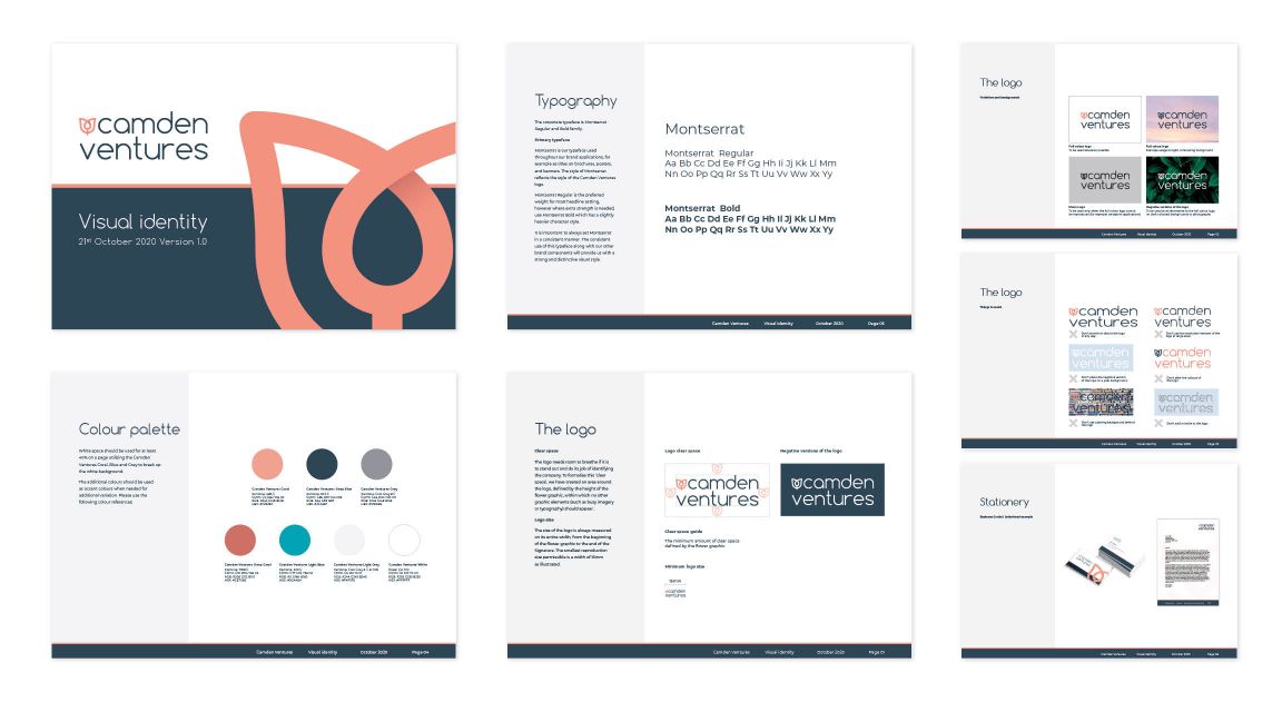
The narrative behind the logo – a flower bud that appears to be opening – illustrates what Camden Ventures is all about, helping budding businesses grow and bloom to reach their full potential. The colour scheme includes a soft coral for the floral logo, which is grounded and complimented by a light, warm grey and a darker wolf grey, creating a contemporary, young yet sophisticated and professional aesthetic.

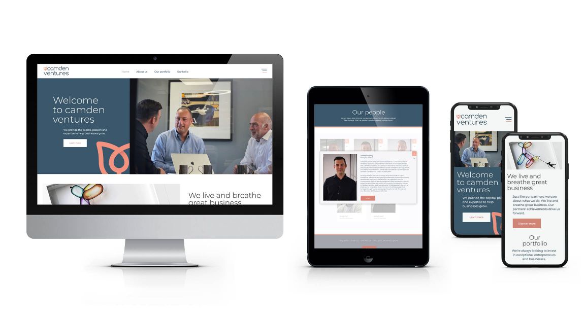
After the initial website and logo concepts were presented back to the client, we started work on a tone of voice guide. We defined exactly how the brand would speak to its existing and new clients through all channels, to reflect its purpose, mission, personality and values. This then fed directly to creating the website copy.

Once the website was designed, we organised a staff photography shoot to provide a personal touch, and bring the website to life though the personalities of the people.

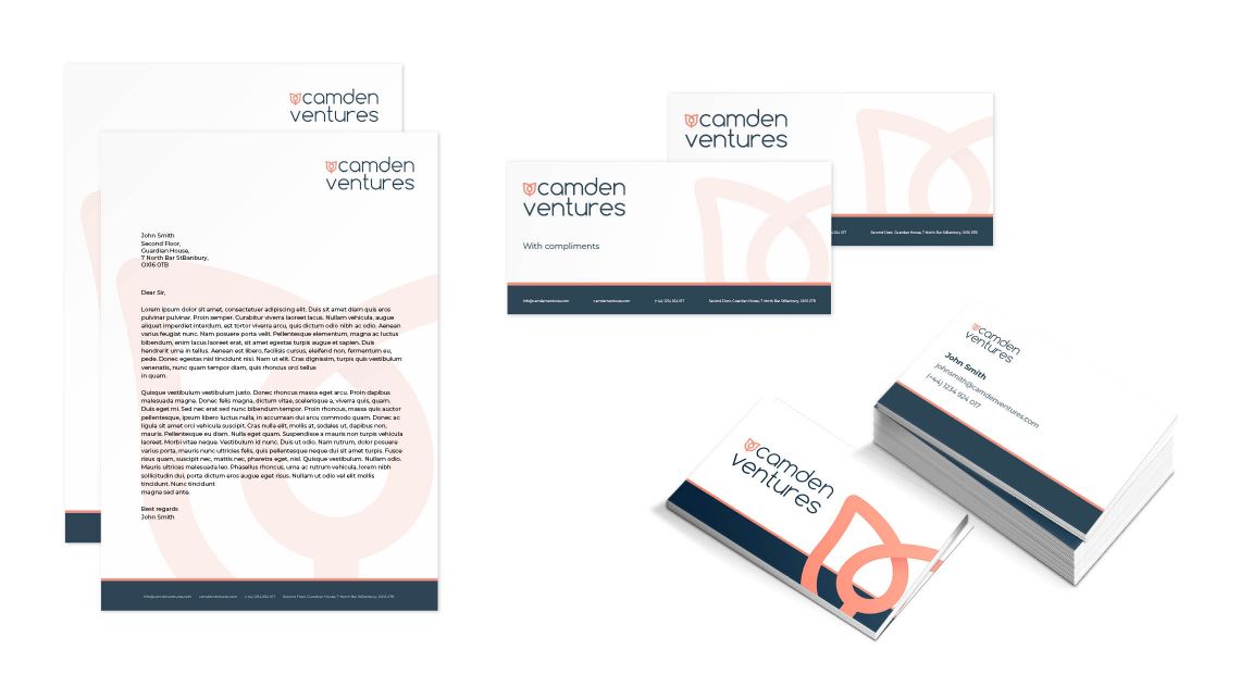
The Think Tank is currently working on new stationery for Camden Ventures, and look forward to any other projects with the client that may arise in the future!